As I was getting closer to the end of my deadlines for the first half of this year, I started finding myself in that weird place of ‘what’s next?’ and ‘Where to after this?’. Here and there I found myself already starting to experiment and working my way to a new path. This painting came to be during that time.
And now I am on the other side of the shows and am still finding myself floundering. This is not necessarily a bad thing. In fact it’s a very necessary thing. What’s next? Where to? Why? What am I curious about? These are all important questions to always ask during the creative process.
But this week I have been having trouble getting back into the studio because of the absurdity of the world and the dread I feel when I read the headlines. Instead of the what’s next and where to questions I find myself going back to- the world is hurting and progress in terms of liberty and equality is sliding backwards, and the prospects of a healthy and sustainable earth seems to be unlikely… my questions have all morphed into one sad “what’s even the point?!” Sigh…
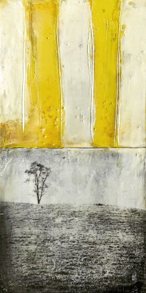
After I painted this piece, I was wondering on Instagram why I seem to be attracted to yellow so much these days, and my friend Jeannie said it was the color of hope. Thank you to Jeannie Pasch for the title of this painting and reminding me that at times I paint what I hope for. It has been a particularly dreary spring, winter and fall here and I like rain and grey days! But it’s been a bit much. So brighter colors have been appearing lately in my work.
My friend Jane Michalski told me that she learned back in art school that yellow is the color which we can perceive the most variations. I thought that was really fascinating and looked it up and I did find that the human eye is more sensitive to yellow and green because they fall right in the middle of the spectrum’s wavelengths. That’s a very scientific explanation, but I want to know why. We must have adapted that way for a reason. The green makes sense- plants are responsible for life on this earth. But yellow? The sun- also responsible for life on this earth. Yellow is also a warning signal in the natural world- think of wasps and certain frogs. hmmm. I wonder….
“Yellow is the eldest daughter of light.” ~Charles Blanc
I love this piece and this post! I’m currently reading ‘Ninth Street Women’ and it’s so interesting (and scary) to see the parallels between the times then and now and how artists were affected along with their work. We just have to keep trying to make a difference and keep painting. Thanks for always reminding us in your discussions and work.
thanks for your comment Judy. I have to look that book up! I think we are all must be affected by current events whether we are conscious of it or not. I’ve always been an energy sponge- taking in the energy around me, so it’s been tough. But I think if i can somehow channel both awareness along with some hope then I can lift myself up….sounds easier said than done though!